LOGO / VISUAL AND VERBAL IDENTITY / POSTERS / SOCIAL MEDIA CONTENTS
OVERVIEW
The Diocese of Belluno Feltre, result of the union of two ancient dioceses, covers the mountain territory of the Dolomites: unique mountains, today Unesco Heritage, symbol of beauty and spirituality, that have partially inspired the chromatic choice of the logo and visual identity together with an other important sign of the area: the Diacono Orso's chalice.
ASSIGNMENT
The request was to create a new, distinctive and unique logo and visual identity for the Diocese of Belluno Feltre, born from the union of two old Dioceses (Belluno and Feltre), taking inspiration from some of the local features, as the cultural and geographical context and able to represent the Diocese in its unicity.
DEVELOPMENT
The shape inspiration of the logo and the visual language that characterizes the brand derives from the Diacono Orso's chalice, an artifact of great artistic and cultural value found in this area, and from the different communities of the territory, under a unique religion Institution, represented by lines with a common origin that visually translate the light rays, symbol of God's Light.
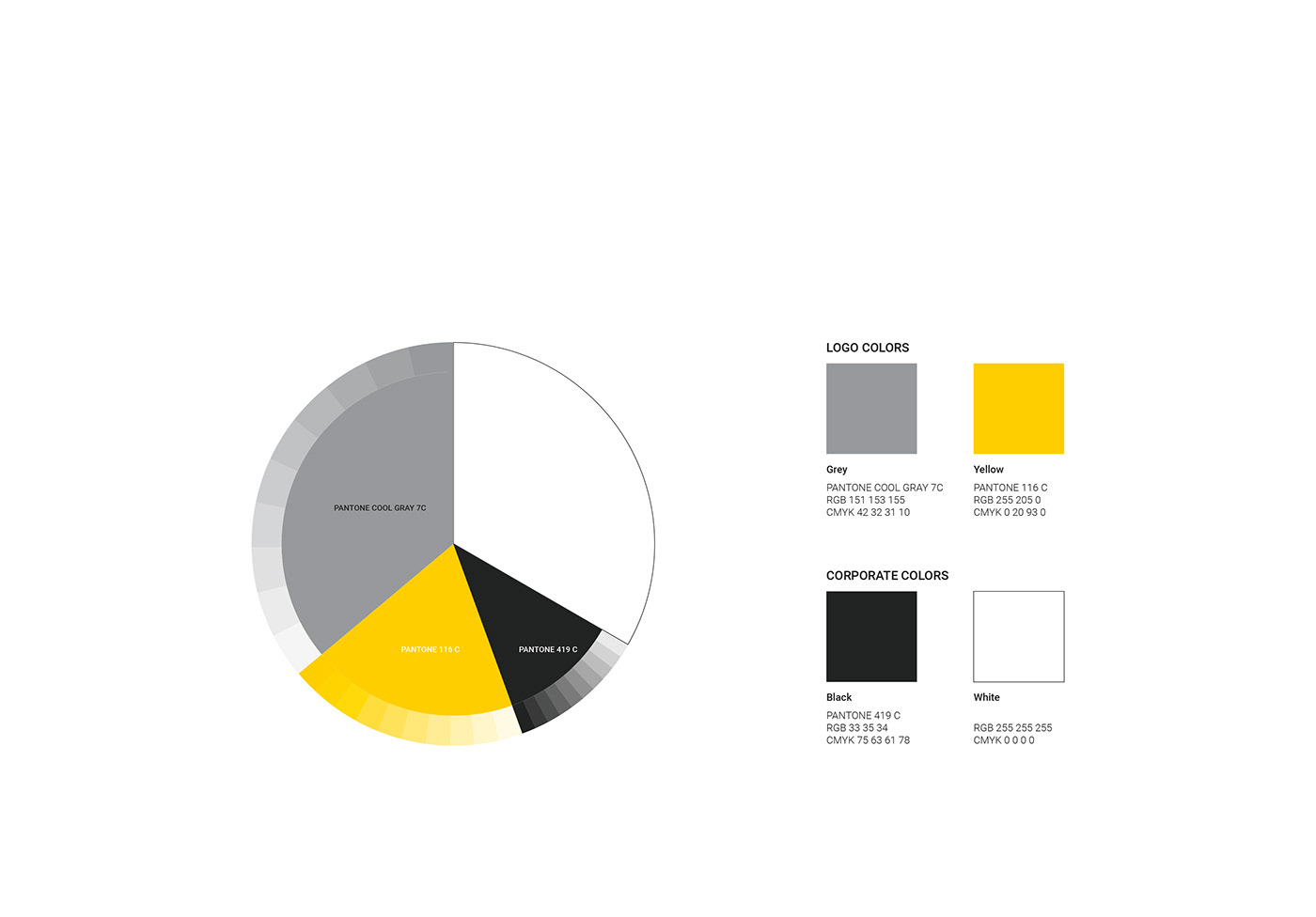
The colors chosen are: grey, for the Dolomites and the Chalice and yellow, that symbolizes the God's Light; the main typography, Frank Ruhl Libre, is a serif that recalls the written on the Chalice.
____________________________________
Project proposal for the contest for the realization
of a logo and visual identity, launched by Diocese of Belluno Feltre.